ResponsiveWebPSourceSet
An ASP.NET Core TagHelper that automatically generates optimized WebP images
and responsive <picture> markup from a single source image.
Automatic WebP Conversion
Converts JPG, JPEG, PNG and GIF images into optimized WebP files automatically.
Responsive Images
Generates <picture> and <source> elements with responsive srcset support.
Performance Optimized
Supports lazy loading, fetch priority, CLS reduction and SEO-friendly markup.
Features
- ✅ Convert JPEG, PNG and GIF to WebP
- ✅ Generate responsive picture elements
- ✅ Automatic srcset generation
- ✅ Configurable media breakpoints
- ✅ Automatic width and height detection
- ✅ CLS reduction
- ✅ Lazy loading support
- ✅ Fetch priority support
- ✅ SEO-friendly markup
- ✅ Responsive by default
- ✅ Lightweight and fast
- ✅ Easy to use
Installation
Install the package from NuGet using the .NET CLI:
dotnet add package ResponsiveWebPSourceSetRegistration
Register the TagHelper in your Razor Pages or MVC project:
@addTagHelper *, ResponsiveWebPSourceSetView
@page
@model IndexModel
@inject IWebHostEnvironment env
@addTagHelper *, ResponsiveWebPSourceSet

@{
    var webRootImagePath = System.IO.Path.Combine(env.WebRootPath, "images", "photo1.jpg");
    var externalImagePath = System.IO.Path.Combine(@"D:\data", "images", "photo2.jpg");
}
Basic Usage
Basic usage of the responsive-webpsourceset tag helper:
<responsive-webpsourceset
    Url="/images/photo1.jpg"
    SourceImagePath="@webRootImagePath">
</responsive-webpsourceset>
External Images
Images that use an externalImagePath require a controller to serve image files from locations outside the web root.
<responsive-webpsourceset
    Url="/external-images/photo2.jpg"
    SourceImagePath="@externalImagePath">
</responsive-webpsourceset>
Custom Configuration
Customize media breakpoints, lazy loading, fetch priority, CSS attributes, and alternative text.
<responsive-webpsourceset
    Url="/images/photo1.jpg"
    SourceImagePath="@webRootImagePath"
    UserDefMedia="2500:1400,1400:800,800:600"
    isLazyLoading="true"
    isFetchpriorityHigh="false"
    cssStyle="border:1px solid black;"
    cssClass="custom-class"
    Alt="Description of the image">
</responsive-webpsourceset>
Generated HTML
Basic Usage - Generated HTML
<picture>
  <source srcset="/images/photo-size2500.webp" media="(min-width:1400px)">
  <source srcset="/images/photo-size1400.webp" media="(min-width:1200px)">
  <source srcset="/images/photo-size1200.webp" media="(min-width:992px)">
  <source srcset="/images/photo-size992.webp" media="(min-width:768px)">
  <source srcset="/images/photo-size768.webp" media="(min-width:576px)">
  <source srcset="/images/photo-size576.webp" media="(min-width:421px)">
  <source srcset="/images/photo-size420.webp" media="(max-width:420px)">
  <img src="/images/photo.jpg" alt="Sample photo" style="max-width:100%; height:auto;" width="3535" height="1032" />
</picture>
Custom Usage - Generated HTML
UseUserDefMedia to define custom image widths and media breakpoints.
Format: imageWidth:min-mediaWidth, separated by commas. UserDefMedia="2500:1400,1400:800,800:600"
<picture>
  <source srcset="/images/photo-size2500.webp" media="(min-width:1400px)">
  <source srcset="/images/photo-size1000.webp" media="(min-width:800px)">
  <source srcset="/images/photo-size620.webp" media="(max-width:600px)">
  <img src="/images/photo.jpg" alt="Sample photo" style="max-width:100%; height:auto;" width="3535" height="1032" />
</picture>
Controller for External Images Only
using Microsoft.AspNetCore.Mvc;
namespace WebRazor10.Controllers
{
    public class ImagesController : Controller
    {
        [HttpGet("/external-images/{fileName}")]
        public IActionResult GetImage(string fileName)
        {
            var imagePath = Path.Combine(  @"D:\data", "images",fileName);

            if (!System.IO.File.Exists(imagePath))
            {
                return NotFound();
            }

            var extension = Path.GetExtension(fileName).ToLowerInvariant();

            var contentType = extension switch
            {
                ".jpg" or ".jpeg" => "image/jpeg",
                ".png" => "image/png",
                ".gif" => "image/gif",
                ".webp" => "image/webp",
                _ => "application/octet-stream"
            };

            return PhysicalFile(imagePath, contentType);
        }
    }
}
Available Attributes
| Attribute | Description |
|---|---|
SourceImagePath (required) |
Physical path to the original source image on the server. |
Url (required) |
Public image URL used in the generated HTML output. |
UserDefMedia |
Optional custom breakpoints, for example (imageWidth:min-mediaWidth)2500:1400,1400:800,800:600. |
cssClass |
CSS classes added to the generated img element. |
cssStyle |
Inline styles applied to the generated img element.
Already included :"max-width:100%; height:auto;" - Responsive image support. |
alt |
Alternative text for accessibility and SEO. |
isLazyLoading (bool) |
Adds loading="lazy" to the generated img element. |
isFetchpriorityHigh (bool) |
Adds fetchpriority="high" for priority image loading. |
width, height
|
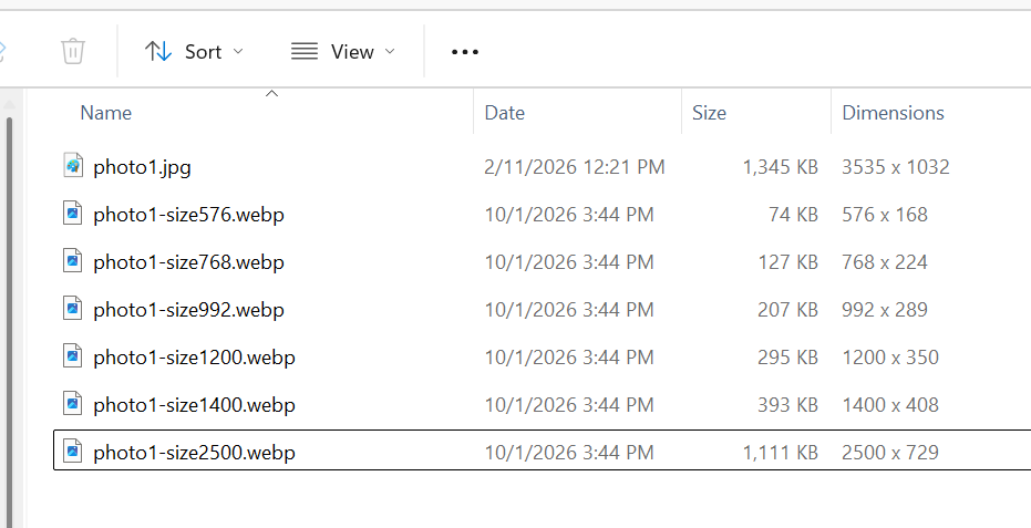
The files will be generated automatically. |
Supported Formats
Input
- JPG
- JPEG
- PNG
- GIF
Output
WebP
Requirements
- .NET 8 or later
- ASP.NET Core
- SixLabors.ImageSharp